 |
wxAccordion
|
|
wxAccordion
|
This library provides the wxAccordion class, which as the name suggests, is an accordion style container control for the wxWidgets library. This is a very simple implementation: the expanding and collapsing mechanism uses nothing but sizers and panels. The control is derived from wxBookCtrlBase so that a programmer familiar wxNotebook or wxAuiNotebook should already be comfortable this class as well.
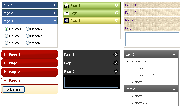
Although this class can't provide all the freedom a programmer would have for building an accordion with HTML/CSS, there is a wide variety of commands for modifying the behavior, layout, and appearance of the control. For example, the caption bars can be drawn with a gradient of 2 or more colors or can use an image file for the background. The caption bars can optionally contain expand/collapse buttons and icons. Here are a few examples of accordions that can be produced with this library:
I've included enough headers with this documentation to generate wxAccordion's entire inheritance hierarchy. The copyright for those headers obviously belong the wxWidgets project and their respective writers.
The original idea for this control and some of the names for the style options came from the excellent foldbar library currently hosted on wxCode.
The build files for this project were created using a slightly modified version of the bakefiles from the wxCode project.